Polish Film Poster Research
This is the first film poster that we looked at to get research ideas for our own personal film poster, as you can see the main colours that appear to be in this poster are relatively dull and dreary. They have used lots of blacks and grey. Also you can see the image of a persons face.
This film poster is also very similar in the way that it uses dull colours as a main point within the poster also you can once again only see the top part of the persons body who is on the poster.
This film poster is also very similar in the way that it uses dull colours as a main point within the poster also you can once again only see the top part of the persons body who is on the poster.
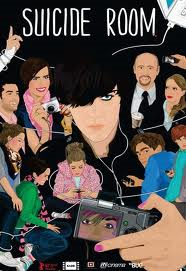
This poster is slightly different to the other that we had looked at in the way that the characters on the front are more cartoon like, but you can still see that the main colour involved within the poster is once again black.
Here is our final film that we looked at once again like the others you can see that the main colour in this poster is black or grey, they are very dreary and this is common throughout all Polish film posters. The writing is in white and is centralised on the poster to highlight its importance. The white colour also makes sure that it does not clash with the dull background colours used.
What we have learnt from the posters we have researched?
That we should use dull colours on the front of our poster preferably black.
We should put only the top half of our characters body on display.
Use white text as it stands out from the dull background colour.
Make text central as it shows importance.
They are all also cartoon based although they have a persons face behind them. They are all in the form of pop art.
They have lots of strange designs on the pictures inlcuding text about what the picture is showing.
The font used in the poster is always mainly in BLOCK CAPITALS and the colour white is used frequently.


